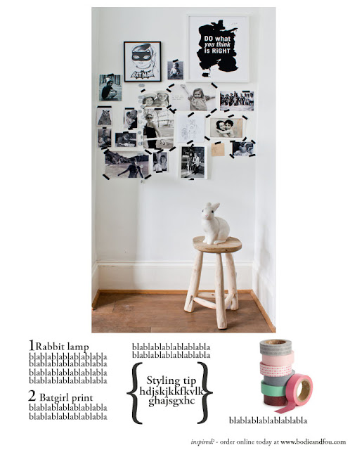
So in our Summer catalogue, we've added a few styling tips throughout the catalogue to show you how you can achieve a similar look in your own home. It's dead easy and inexpensive.
We've also re-shot two versions of my moodboard with the Rabbit lamp (which never quite made it to Mila's bedroom) and this Do What You Think is Right print which is seriously becoming my mantra.
Since you were SUPER helpful last time, I would love to know which one you prefer.
I thought a close-up (pic 3) would be visually stronger but once we dropped each image into a (very rough) mock-up, we all felt in the office that the first two images fitted better the layout of the page and then it is a choice between image 1 and image 2.I would really appreciate your feedback on this! Many thanks!


0 comments:
Post a Comment